Discovery
Following a major rebrand developed in partnership with DixonBaxi, Capital One needed to bring their own people on board. The brand had gone through multiple iterations over the years, leaving associates confused and fatigued, outdated email footers, inconsistent colour palettes and conflicting logo lockups were showing up across internal and external communications. I provided creative direction and led the internal awareness campaign, which I named More than a lick of paint. The name was deliberate, honest about the scale of the change, and designed to signal that this was a proper reinvention rather than another cosmetic update.

Design
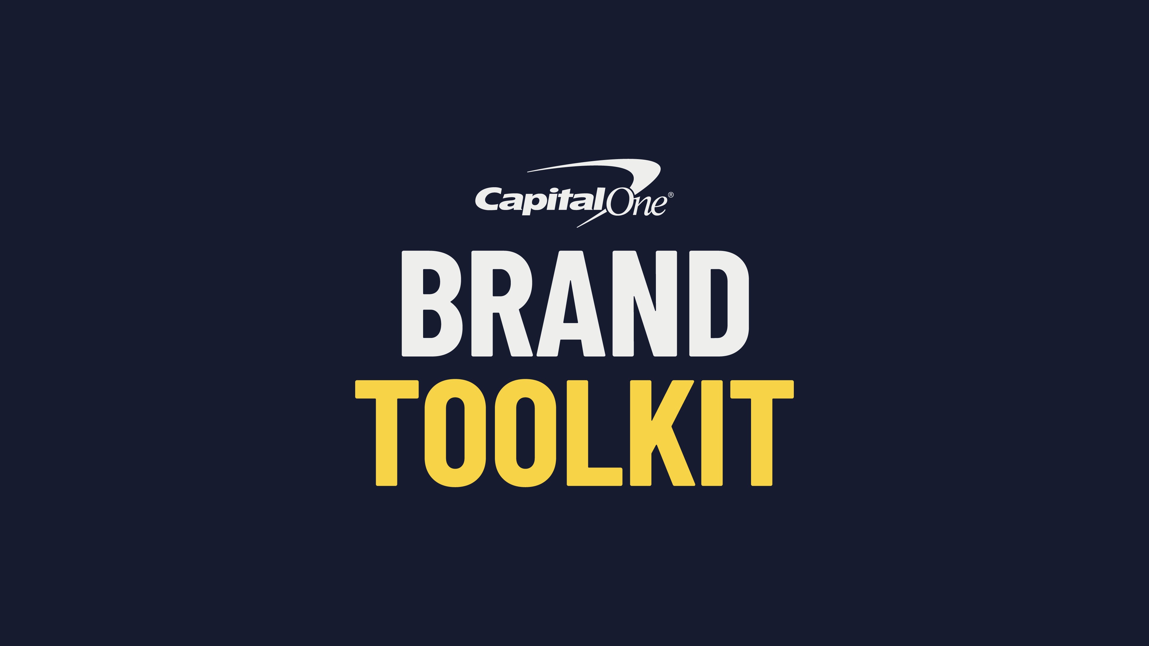
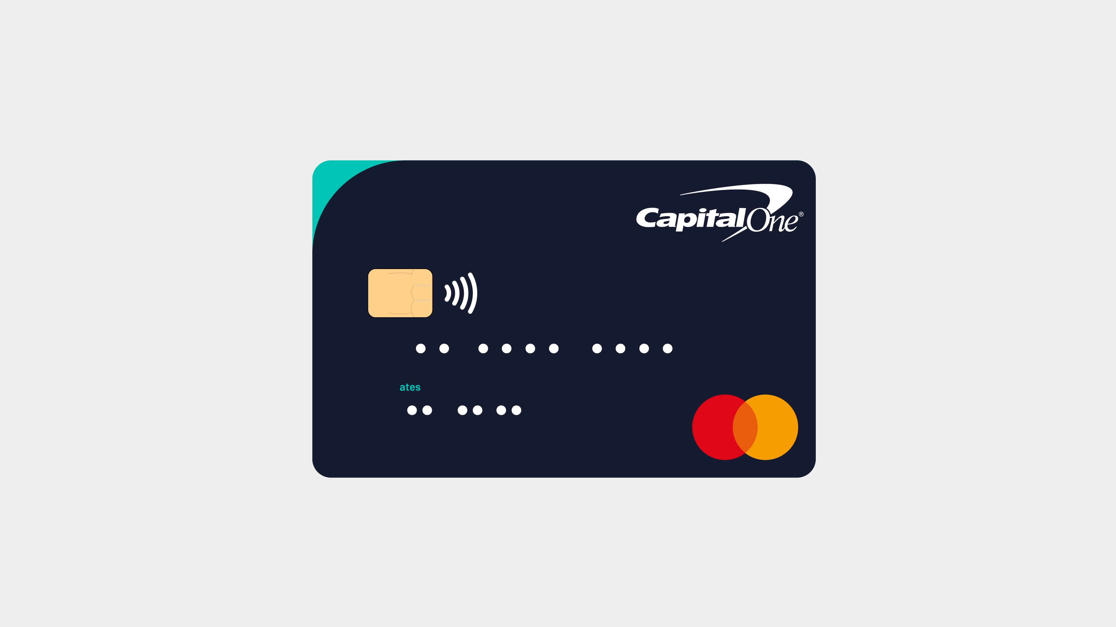
The central challenge was making a brand refresh feel real and relevant to people who hadn't been part of creating it. A PDF guidelines document wasn't going to do that, so the campaign was built around physical and digital touch points that made the new brand tangible rather than theoretical. The spray can became the campaign's visual anchor. a nod to the name and a way of making something traditionally corporate feel immediate and creative. Oversized spray cans with QR codes linked directly to the brand portal, digital screens carried spray can animations across communal areas and a pop-up event gave associates hands-on access via iPads. Alongside the activations I developed the internal brand toolkit and portal on the intranet, giving associates a single destination for all assets and collateral, from merchandise ordering through to letterheads, comp slips and templates.


Delivery
The portal received over 1,000 hits in its first week from associates across London and Nottingham, a clear signal that the campaign had landed. The combination of physical activations and a well-structured digital resource reduced confusion, drove adoption and ensured the refreshed brand was applied consistently across the organisation from day one.
